


SUMMARY
Historically, whenever house prices in the US have risen at a rapid and excessive rate, they have subsequently tended to decline. Further, these house price declines have been accompanied by an economic recession, either at a regional or national level. At a state level, the historical data also shows that states with the biggest house price declines generally tend to be those with the most severe recessions (as measured by increases in the unemployment rate).
The US has experienced a rapid and excessive run-up in house prices during 2020-2022. As a result, measures of affordability are showing that housing is less affordable now than at any other period including at the onset of the Global Financial Crisis (GFC). Further, this increase in house prices has been more broad based geographically than the one prior to the GFC. Given this, it seems likely that there can be a significant decline in house prices that is also more national in scope than experienced during the GFC and, further, that this will be accompanied by a recession.
To date, house prices nationally have grown rapidly till mid-2022 and, since then, have grown at a much slower pace. At the state level though, house prices have shown declines in some states. Similarly, the unemployment rate at the national level bottomed out in early 2022 and has stayed there since with a small increase in the last 6 months. However, several states have experienced an uptick in their unemployment rates since 2022.
We find that the states that have shown a decline in house prices since 2022 are somewhat more likely to have had an increase in their unemployment rate over the same period. This pattern is similar to that observed in past recessions and could be an early indicator of an upcoming recession as well as of a regional or national housing downturn.
HOUSE PRICE INCREASES AND DECLINES
As noted above, large house price increases have tended to be followed by large declines. Further, if a state (or metro) has a larger house price increase, it is more likely that it will also experience a larger house price decline.
Fig. 1 shows house price increases and declines before and after the GFC. The house price data cover all 50 states plus DC and are based on the FHFA All Transactions House Price Index (which is the index used in this and subsequent graphs). The house price increases are over the 3 years prior to the peak house price for that state and the house price declines are from the peak to the bottom subsequent to the GFC.
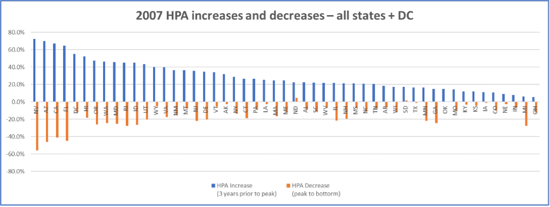
Figure 1: 2007 – HPA increase(decline) before(after) the peak
Source: FHFA all transactions house price index
The states are ordered from the left in terms of decreasing house price appreciation (HPA) to the peak and the states with the largest increases in HPA are NV, AZ, CA and FL, which was well noted at that time. Viewing Fig 1, it seems the case that states with higher house price increases prior to 2007 generally had larger declines from the peak.
This point can be seen more precisely in Fig 2 which shows a scatter plot of the HPA increase prior to the peak against the HPA decrease from the peak to the bottom. There is a downward sloping trend to this graph which persists even if the data points pertaining to the 4 states with the largest HPA increases and decreases (NV, AZ, CA, FL) are excluded (if desired, please contact the authors for this graph).
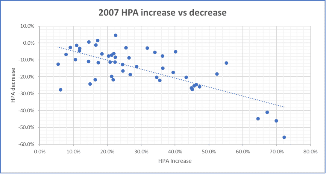
Figure 2: 2007 – Scatter Plot – HPA increase prior to peak vs HPA decrease peak to bottom
Source: FHFA all transactions house price index
Figs 3 and 4 make this same point for the 1990 recession. Both CA and the New England states saw big run-ups in house prices prior to that recession and correspondingly large declines resulting from the recession reinforcing the point that geographies with higher house price increases prior to the peak generally had larger subsequent declines from the peak.
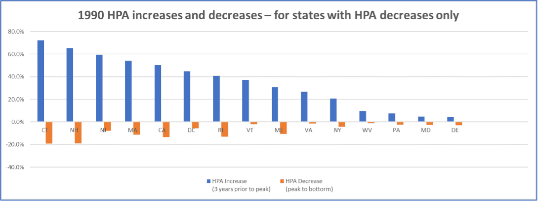
Figure 3: 1990 – HPA increase(decline) before(after) the peak
Source: FHFA all transactions house price index
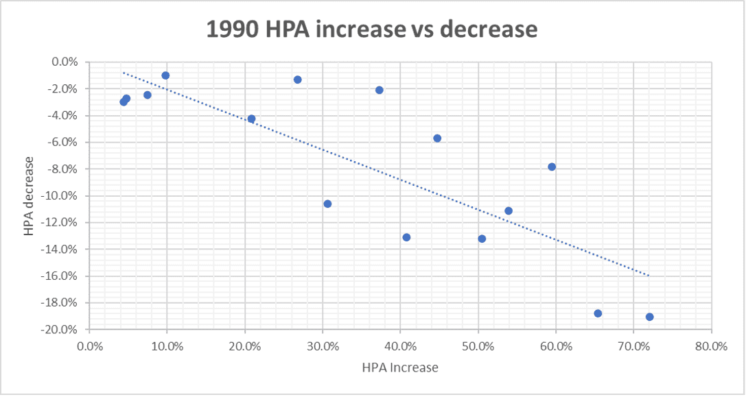
Figure 4: 1990 – Scatter Plot – HPA increase prior to peak vs HPA decrease peak to bottom
Source: FHFA all transactions house price index
HOUSE PRICE DECLINES AND RECESSIONS
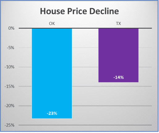
Figure 5a: Mid-80’s – Southwest Regional House Price Decline
Source: FHFA all transactions house price index
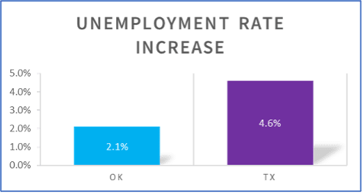
Figure 5b: Mid-80’s – Southwest Regional Unemployment Rate Increases
Source: BLS Geographic Information
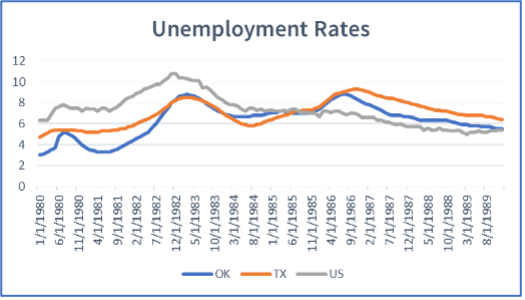
Figure 5c: 1980’s – Unemployment Rates for OK, TX and US
Source: BLS Geographic Information
In the late 80’s – early 90’s, CA and the New England states suffered major house price declines accompanied by recessions in those states. This caused a national recession (the 1990 recession) though the recessions in the above states were more severe (as measured by increases in unemployment). Figs. 6a, 6b and 6c show the house price declines and increases in unemployment rates for CA, the New England states and the US.
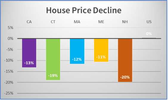
Figure 6a: Early 90’s – CA and New England Regional House Price Decline
Source: FHFA all transactions house price index
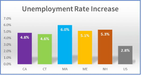
Figure 6b: Early 90’s – CA and New England Regional Unemployment Rate Increases
Source: BLS Geographic Information
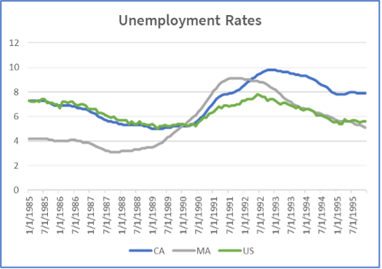
Figure 6c: Early-90’s – Unemployment Rates for CA, MA and US
Source: BLS Geographic Information
As is well known, the GFC was the most severe recession and saw the biggest national house price decline since the Great Depression. At the same time, the states that had the biggest house price declines (CA, FL, NV, AZ) experienced even more severe recessions (as measured by increase in unemployment) than the US national average. Figs. 7a, 7b and 7c show the house price declines and increases in unemployment rates for CA, FL, NV, AZ and the US.
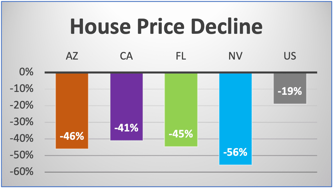
Figure 7a: 2007 – House Price Decline for most impacted states vs US average
Source: FHFA all transactions house price index
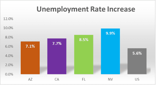
Figure 7b: 2007 – Unemployment Rate Increases for most impacted states vs US average
Source: BLS Geographic Information
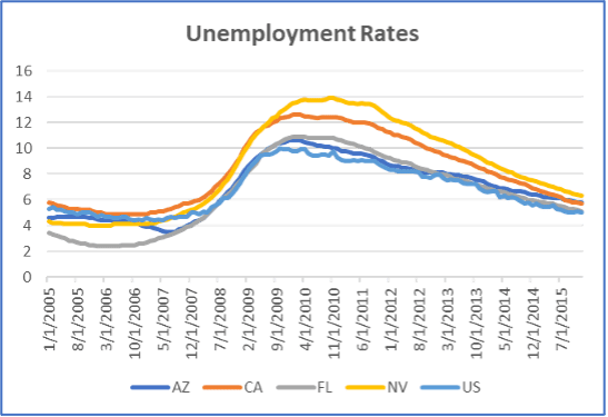
Figure 7c: 2007 – Unemployment Rates for most impacted states vs US national average
Source: BLS Geographic Information
HOUSE PRICE INCREASES TILL 2022
There has been a rapid and excessive increase in house prices leading up to 2022. This increase is not only comparable to that seen in the run-up to 2007 but is also geographically much more widespread than was the case in 2007. Given the historical patterns presented earlier, it implies that any house price decline is likely to have a correspondingly larger geographic footprint and impact a bigger population than in 2007.
Fig 8 shows a comparison of the 3-year HPA prior to the house price peak in 2007 and 2022 for all 50 states plus DC. It can be seen clearly that many more states have high HPAs in 2022 as compared to 2007. One way to quantify this is to note that, for 2022, 45 states had 3-year HPAs prior to the peak that were greater than or equal to 30% while only 20 states met the same condition for 2007. As a result, the US national 3-year HPA (which is a weighted average of the states’ HPAs) prior to the peak in 2022 was 42.5% while the corresponding for 2007 was 28.3%.
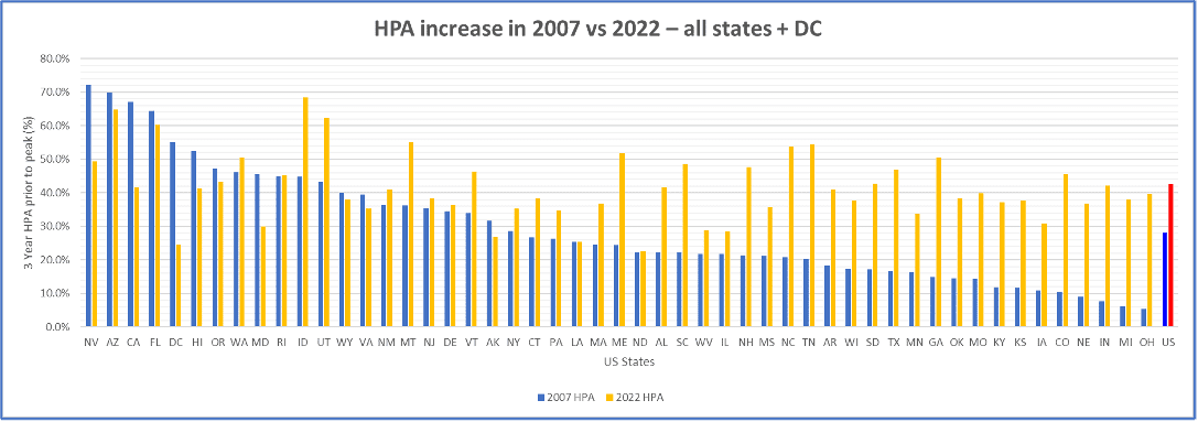
Figure 8: 3-year HPA prior to peak for 2007 and 2022
Source: FHFA all transactions house price index
Figs. 9 and 10 provide different views of visualizing the much greater geographic breadth of house price increases in 2022. Fig 9 rank orders the states by their HPAs in both 2007 and 2022 and presents these in order of declining HPA from left to right. Note that this way of presentation implies that the 2007 HPA and 2022 HPA (blue and orange bars respectively) may not necessarily correspond to the same state i.e. a state which had the 5th highest HPA in 2007 may not be the state that had the 5th highest HPA in 2022. What Fig 9 shows is that the HPA increases in 2007 drop off quickly after the top 15 or so states while, in the case of 2022, they drop off much more slowly.
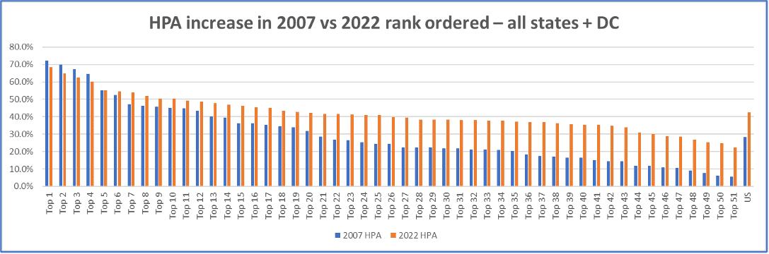
Figure 9: 3-year HPA prior to peak for 2007 and 2022 – Rank Ordered
Source: FHFA all transactions house price index
Fig 10 shows box plots of the HPAs for the 50 states plus DC in both 2007 and 2022. The box plots show that the average (mean or median) HPA across states is much higher and the dispersion of HPA’s across states is much smaller in 2022 than in 2007. Essentially, most states in 2022 had high HPAs prior to the peak while only a smaller number had correspondingly high HPAs in 2007.
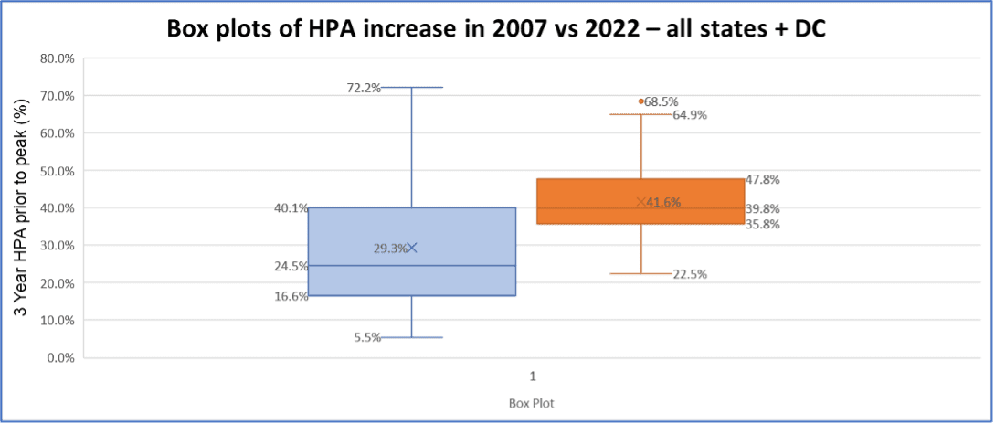
Figure 10: 2007 vs 2022 – 3 year HPA prior to Peak Box Plots
Source: FHFA all transactions house price index
HOUSE PRICES SINCE MID-2022
Since mid-2022, the growth rate of house prices has slowed. Depending on the index, there was either a dip (Case Shiller) or a sideways move (FHFA) for the rest of 2022 which was then followed by increasing house prices in 2023 albeit at a slower pace. Figs. 11 and 12 show the Case Shiller US National Index and the FHFA All Transactions Index respectively.
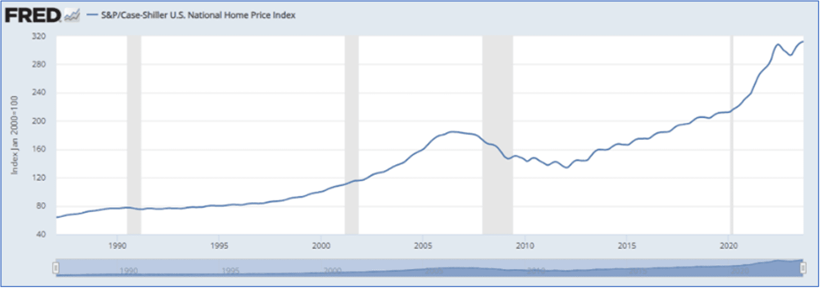
Figure 11: Case Shiller US National Index
Source: FRED S&P CoreLogic Case Shiller
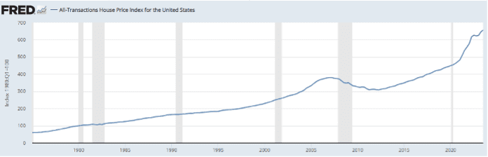
Figure 12: FHFA All Transactions HPI for US
Source: FRED FHFA All Transactions Index
Underneath the national indices, however, there are large differences in house price growth rates at the state and metro levels with areas in the West showing declining house prices and other areas either flat or showing continued increases. Fig 13 shows the house prices for the various metros in the Case Shiller 20 City Index as reported in Nov 2023 and a number of these show declines since their peak.
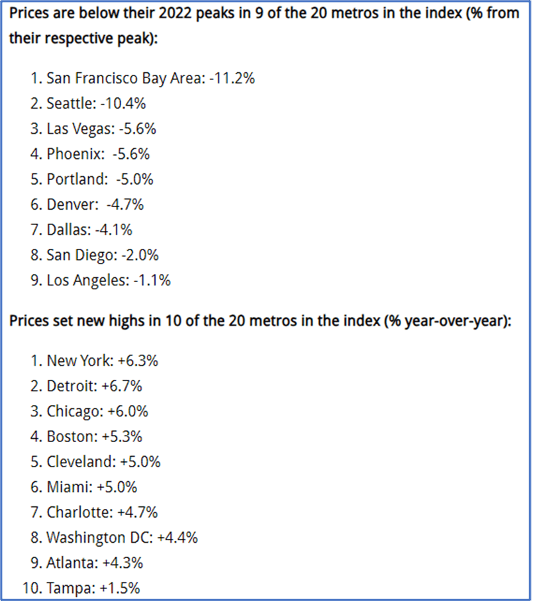
Figure 13: Case Shiller 20 City Index
CURRENT HOUSING AFFORDABILITY
Housing is very unaffordable today as measured by metrics such as
- Price to income ratio
- Mortgage payment to income ratio
- Price to rent ratio
As shown in Figs 14-16, housing is as, if not more, unaffordable than at the height of the housing bubble preceding the GFC. It is unlikely that mortgage rates can drop by enough to facilitate greater affordability and a drop in house prices is, therefore, the main way to make housing more affordable.
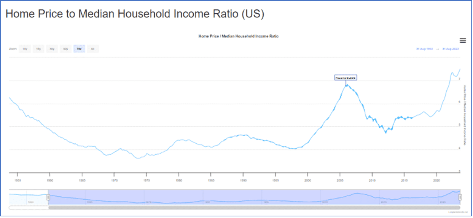
Figure 14: Home Price to Median Household Income Ratio (US)
Source: https://www.longtermtrends.net/home-price-median-annual-income-ratio/
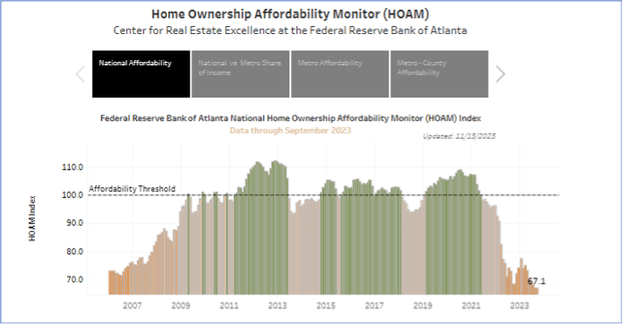
Figure 15: Home Ownership Affordability Monitor (HOAM)
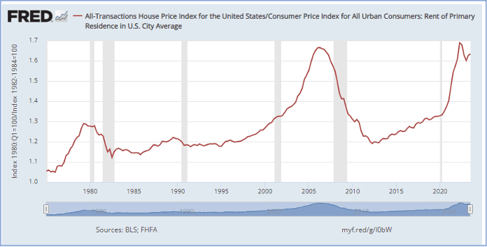
Figure 16: House Price to Rent Ratio for US
Source: https://fredblog.stlouisfed.org/2018/09/is-the-housing-price-rent-ratio-a-leading-indicator/
STATES WITH DECLINING HOUSE PRICES SINCE 2022
Fig 17 shows that 16 states (including DC) had house price appreciation (HPA) of 4% or less over the last year (Q3 2022 – Q3 2023) for which data is available from the FHFA All Transactions Index. Of these, 6 states had negative HPA (one, LA, is barely negative).
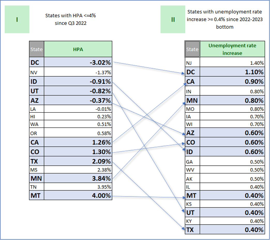
Figure 17: Correlation of states with HPA<=4% with states with Unemployment Rate increase >= 0.4%
Source: FHFA all transactions house price index, BLS Geographic Information
STATES WITH RISING UNEMPLOYMENT RATES SINCE 2022
At the national level, as of Oct 2023, the unemployment rate had risen by 0.5% since its bottom (3.4% to 3.9%). At the state level, as of Oct 2023 and shown in Fig 17, there are 20 states with an increase of at least 0.4% in the unemployment rate since the bottom for that state. This group includes the two most populous states – CA (0.9%) and TX (0.4%).
STATES WITH GREATER INCREASES IN UNEMPLOYMENT TEND TO ALSO HAVE LOWER INCREASES IN HPA
Note that Figs 5-7 show that, historically, house price declines are accompanied by recessions and, further, states that saw the biggest declines tend to be those with the most severe recessions (as measured by their increase in unemployment). In light of that, we examine the recent joint behavior of house price and unemployment rate data in Fig 17. What we find is that states that saw larger increases in their unemployment rate include a disproportionately greater number of states with lower HPA. As seen in Fig 17, 31% of all states (= 16/51) have 1 year HPA <= 4%. However, of the 20 states with an increase of at least 0.4% in the unemployment rate, 45% have 1 year HPA <= 4% (= 9/20).
Alternatively, states that experienced a lower HPA include a disproportionately greater number of states with larger increases in their unemployment rate. 39% of all states (= 20/51) have an increase of at least 0.4% in the unemployment rate. But, of the 16 states with 1 year HPA <= 4%, 56% (= 9/16) have an increase of at least 0.4% in the unemployment rate.
CONCLUSION
As noted earlier, large house price increases have tended to be followed by large declines and, further, such declines have been accompanied by recessions. The excessive increase in house prices till 2022 is comparable to 2007 while being much more geographically widespread. This has increased the risk of a large decline in house prices and of a recession. Given this, along with the historical relationship between the depth of decline in house prices and the severity of a recession across states, the pattern that we are observing over the past year (outlined in Fig 17) is suggestive of a decline in house prices and of an accompanying recession.